The first thing you may think as you look at today’s before image is “How in the world am I going to get all of that red-colored mess off?” Or it may not be, but for the sake of argument, we’ll just say it is. Here’s what you need to do to fix this. Pay attention to all the steps, here…
Go to your Adjustments panel and choose the Black and White adjustment. Since this is a red-colored mess we’re dealing with, go to the High Contrast Red preset. Now select OK. Did you get all that?

Obviously from looking at the image you can see I’m not funning you! Sometimes it really is just that easy, especially when the problem area is distinctly a red, blue, yellow or green tone. If nothing else, this article should serve to show that it’s an area that should be checked, especially in a photo that was originally black and white or one that you’d be ok with being converted to B&W.
Since this article is so short it barely warrants the description “article” (“check out my paragraphs on tipsquirrel.com!”), I’ll go ahead and go over the very few other steps I took to finish the image.
I don’t care for straight-up black and white or greyscale. I think all images look better with at least a little color tone to them and the person to whom this image belongs wanted the finished image to have something like the original color, so I sampled a portion of the frame that had a color I thought might look good. I then made a new, blank layer and filled it with the color. Since the color you just sampled should be the foreground color, use keyboard shortcut Alt or Opt + Backspace to fill.

Now go through the layer blend modes to see how each one affects the fill layer. I liked how the Vivid Light mode looked both in terms of what I’m going to do later and the brightness and clarity of the image itself with it applied.
Next it was just some simple clean-up of the cracks using, mostly, the patch tool with some healing brush. I worked in the 200% - 300% zoom range to make sure I was getting everything and not leaving any smudges or artifact behind.
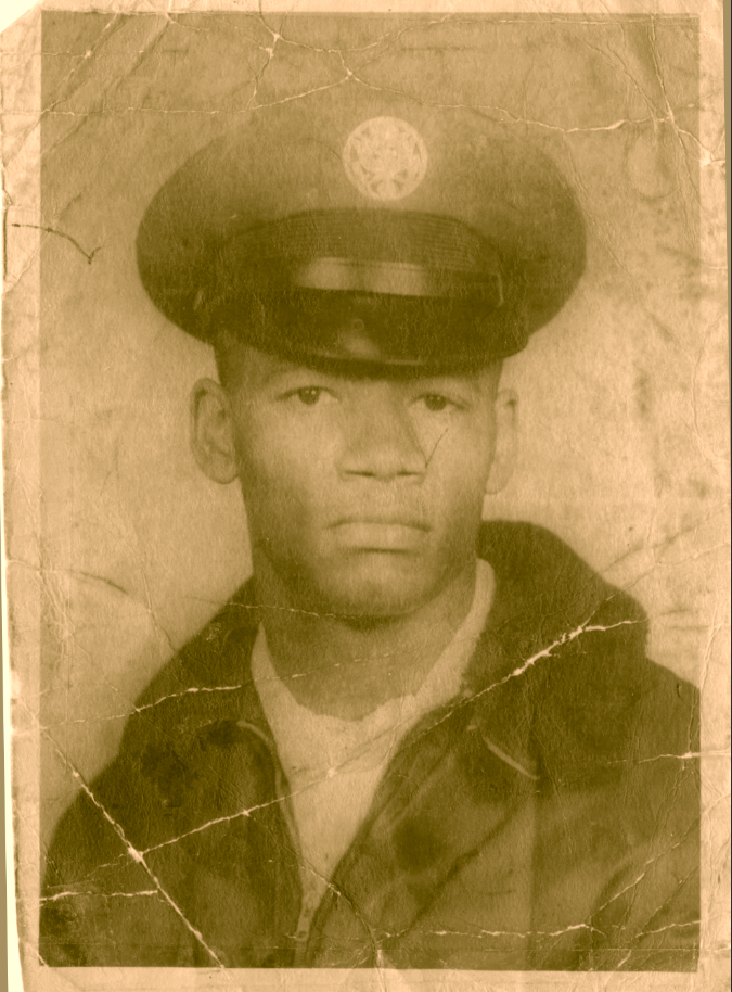
You may notice the insignia on the hat is a little clearer in the last version. The client requested this if I could arrange it. He told me specifically what it was, so I went online and found an image of the insignia which I then separated from the background, re-sized to fit the area, used a Soft Light Blend Mode to help integrate it with the original, and brought the Opacity down to around 17%.

Now all that’s left are a few details like replacing the frame and taking down the color just a tad. To do this I simply made another Black and White Adjustment Layer, kept it on the default preset and brought down the Opacity to 25%.
Kind of amazing how an image that looks so bad at first can be improved so quickly and easily, isn’t it? I do wish they were all this easy!


No comments:
Post a Comment