Wednesday 30 January 2013

Image Variations with Photoshop Gradient Maps

Originally posted at TipSquirrel.com
Photoshop Nut : 
Michael Hoffman


GradientMap-01If you look in Photoshop’s Adjustments Panel, right at the very bottom, in the last position, there is the really technical sounding “Gradient Map.” If you haven’t seen this adjustment in action, or known what it can do, you’d be entirely likely to pass right over it – it sounds complicated. But, it isn't  Gradient Maps are one of the simplest ways of toning or tinting an image. In fact, if you like to tinker with your image, searching for a certain “look,” the Gradient Map can provide a seemingly endless train of color variations, all with a few clicks. Let’s see how it works.

 We’ll start with the image above, and very quickly, we can open the Adjustments Panel and click Gradient Map (Or, if you prefer menus, Image > Adjustments > Gradient Map… will get you there). The adjustment layer is added, and the Property Panel opens, showing the gradient picker and controls:

GradientMap-02
 

At this point, the default gradient is applied to your image, in a very predictable way. Looking at the gradient from left to right, the colors on the left are applied to the darkest tones in your image, and the colors on the right are applied to the lightest tones – with the tones in the gradient “mapped” to the highlights and shadows of the image. With the default black and white gradient, this gives us a black and white image, like so:

GradientMap-03
 

 Now, this in itself isn’t really amazing or surprising – after all, there are dozens of ways to get a grayscale image within Photoshop. No, the variations come as we change the gradient, which is mapped to the image tones. We can click the drop down arrow next to the gradient and pick a different gradient (such as Copper), which is mapped onto the image tones the same way:


Monday 28 January 2013

Cutting the fringe – Selective Colour in Photoshop

Originally posted at TipSquirrel.com
Photoshop Nut : 
Scot Baston


I encountered a little problem the other day while creating something in Photoshop.. not my usual photography but pulling some low resolution text from a black background. Normally the route would be to create a selection and to use refine mask to remove any stray edges of the background. In this case the text was so small and with the compression on the original file, the refine edge option was not working for me, especially when you add in the complexity of the shape. Below is an example of what I had to work with..

cuttingthefringe

my final image would be on a white background, so lets try the normal route first
  cuttingthefringe2
As you can see, selecting the black background and using refine edge did not create the best result when shown on a white background. I'm sure better could be achieved by taking the time, zooming in to the text and using the refine edge brush around each of the letters.. but who has time for that? First steps first.. lets select the text from the black background. Using the Magic Wand tool (W), set the tolerance to around 10 and uncheck the contiguous checkbox.. then select the black background

  cuttingthefringe4 

 With the Background selected, create an inverted layer mask by holding down the Alt key and clicking the 'add layer mask' button at the bottom of the layer mask panel.

cuttingthefringe5
 

 Adding a simple white background layer underneath the cut out layer shows our current text with accompanying black fringe.

cuttingthefringe6
 

 So how to get rid of the horrible black fringe without losing the feel of the text and without spending ages refining the mask. My solution was to use the Selective Colour Adjustment Layer...

Saturday 26 January 2013

Lightroom 4 Adjustment Brush Tricks

Originally posted at TipSquirrel.com
Photoshop Nut : 
Michael Hoffman

Lightroom 4 Adjustment Brush Tricks
Lightroom 4 brings all the same capabilities you'll find in Camera Raw for the Adjustment Brush, as well as the Graduated Filter. Add multiple effects, control your image non-destructively. Plus, Lightroom adds some nifty controls all its own to make your editing more efficient.


Monday 21 January 2013

Symmetry with Photoshop

Originally posted at TipSquirrel.com
Photoshop Nut : Gavin Hoey


TS-SymmetricalAs a photographer symmetry is one of the hardest types of composition you can find. Nature has a habit of avoiding symmetry most of the time. You’ll never walk through a forest and find two identical trees and you’ll never see the left side of the sky perfectly matching the right. However it is dead easy to create symmetrical images using Photoshop, the knack is disguising the fact that you used Photoshop at all. In this video I’ll show you how to mirror an image and then apply a few tweaks to complete the perfect symmetric photo.


Sunday 20 January 2013

Photoshop Clipping Masks

Astonishing chocolate swirlOriginally posted at TipSquirrel.com
Photoshop Nut : Eric Renno

In this video I take a look at Clipping masks. They are really easy to create and have a whole host of applications. This video was made in response to a question in the Google Plus Community; Photoshop and Lightroom Users where I’m one of the moderators. i think it goes without saying, I’d love to see and chat to you there!


Saturday 12 January 2013

From The TipSquirrel.com Archive : Shooting Tethered in Lightroom

Originally posted at TipSquirrel.com
Photoshop Nut : Scot Baston

One of the fantastic things about Lightroom is the way it can streamline a photographer's workflow. Lightroom allows the creating of presets and applying them over a complete shoot, even applying those presets on import ( see my previous tutorial). These can save hours of boring, time consuming, repetitive post production that benefits neither the client or the photographer. Recently I had to shoot a series of product shots for a client, each shot would be set up exactly the same and would require the same post processing. Now using presets I could shoot all of the images, import them into Lightroom and apply a preset to all of the images, but the finished images could not be reviewed until the shoot was complete. This might mean going back and reshooting which would be time consuming and expensive. Shooting Tethered A better way would be to shoot tethered in Lightroom. For those that don't know, shooting tethered is having your computer (and Lightroom) connected directly to your camera during the shoot. No more looking at the back of the camera and trying to figure out if the images are in focus, no more massive upload at the end of a shoot, and much less guesswork as to the look of the final image. Most DLSR's today have the ability to shoot tethered using a simple USB cable connected to both the camera and your computer. In my example I had my camera set up on a tripod directly above my studio setup and a USB cable connecting the camera to my laptop & Lightroom.

Setting up Lightroom for shooting tethered

Start tethering 


Saturday 5 January 2013

From The TipSquirrel.com Archive : Getting Started in HDR Pro

Originally posted at TipSquirrel.com
Photoshop Nut : Richard Harrington


HDR_Stones_In this exclusive video for TipSquirrel.com Rich Harrington show’s us how to get our images into HDR Pro and what to do with them once they’re there!      

Books_Amazon_Harrington

Friday 4 January 2013

From The TipSquirrel.com Archive : Vintage Effects with Photoshop

Originally posted at TipSquirrel.com
Photoshop Nut : 


imageJustin Seeley returns to TipSquirrel.com with a video looking at a couple of ways to get a vintage effect using adjustment layers in Photoshop. Don’t forget to check out Justin’s brilliant series’ at Lynda.com where he presents tutorials on a range of subjects from Facebook and Pinterest to Magento Ga and Illustrator!


Thursday 3 January 2013

From The TipSquirrel.com Archive : Building an ebook in Lightroom

Originally posted at TipSquirrel.com
Photoshop Nut : Scot Baston


Today I thought I would try something a little different.. How about creating a book in Adobe Lightroom 4, converting it to an ebook and publishing it to the Apple iTunes (and Blurb book store). Does that sound different enough? The finished ebook will be available in the epub format used by Apple iPad and iPhone and should look something like this.. [caption id="attachment_14869" align="aligncenter" width="600"]Zooming Feet Wedding ebook free ebook created using Lightroom 4 and Blurb[/caption] So lets get started.. Select the images you would like to use in your ebook and go to the Book module Adobe Lightroom 4 Book Module 
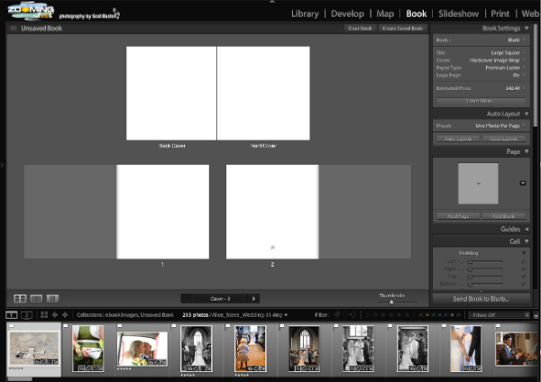
As you can see above, all my images are showing in the bottom panel ready for placement. Before that, we need to set the defaults for our ebook. ebook settings Do not be put off by the price in the screenshot above.. Lightroom only understands physical books at the moment and in this example we can create an ebook for free! I have chosen a square format book for this example, although the Standard Portrait might be a better option for creating an iPad ebook. So lets get started and create our front and back page.. format the first ebook page Select the first page and click the little arrow in the Page panel on the right. This will bring up the pre-formatted options. As I want both the front and back covers to be full page photos I choose the 1st option. [caption id="attachment_14872" align="aligncenter" width="599"]Drag and Drop the image onto the page Drag and Drop the image onto the page[/caption] Now, select an image from the film strip and drag it into place on your page. Using this multi page view is very handy for getting the overall order of your images in your ebook, but to fine tune how the page looks it is best to switch to either the double or single spread views Page Views With the Double Page Spread view selected I can position my cover image by dragging the image and changing the zoom settings. Positioning the cover image Now we can create a title for our cover page by ticking the Page Caption box in the Caption panel. Creating a Title There are many formatting options that allow placement and styling of the text. One thing to consider if, as in this example, we are creating for the iPad is the choice of Fonts. Blurb advise that you use one the following fonts to prevent formatting errors when converting to iPad format. Helvetica, Century Schoolbook, Futura, Verdana, Courier, Arial, Garamond, Trebuchet, Georgia and Times. I have not used fonts from the selection in this example but Blurb allows you to alter this during the conversion process. Adding pages could not be easier.. Adding new pages Keep adding and populating your pages until you have a completed book. Now Save the book by clicking the Create Saved Book button in the top right.. Create Saved Book The book is now ready to send to Blurb to be converted to an ebook. Send to Blurb This will bring up a loading page for Blurb.. do not be put off by the price as we use this book to create an ebook. Loading ebook Be aware that this uploading process may take a while.. make some tea, maybe even lunch and supper while you are at it. When it is finally complete, a web page will automatically open at the blurb website. Convert to ebook As you can see there is a link to automatically convert you Lightroom created Book into an ebook. Click the link. ebook creation page Click continue and you will be asked to convert any non standard fonts Change fonts The Blurb website will then notify you of any formatting issues and help you to correct them Correcting formatting problems Click the page number to take you to the page (Page 1 in this case).. Fit the text The warning tells us that the text overflows the text box. This is simple to fix by either changing the font size or in this case, making the text box a little bigger. Publish ebook Once you have fixed any minor problems with formatting, click the Complete and Publish button in the bottom right. Blurb Book Store Test your new ebook by downloading it to an iPad or iPhone to make sure that the formatting looks fine. Publish to Blurb and Apple When you are happy with your downloaded ebook, you can now add it to the Blurb bookstore and submit it to Apple iBookstore (if you want your ebook on iTunes). The submission to Apple can take up to 2 weeks, although can happen much quicker. Now everything is done! You can preview your ebook in the blurb bookstore and others can download it for their own viewing pleasure. Blurb Bookstore preview and for those who want to see the finished result.. Download the ebook from Blurb or iBookstore     I hope you managed to stick with me through this process, it is easier to do than explain! If you would like to find out more about Blurb and Adobe Lightroom 4 book creation.. Please check out Richard Curtis' upcoming webinar on creating extraordinary blurb books in Lightroom    As always, please ask questions or comments below and feel free to share the knowledge.

Wednesday 2 January 2013

From The TipSquirrel.com Archive : HDR Sharpening in Photoshop

Originally posted at TipSquirrel.com
Photoshop Nut : Janine Smith


I recently put a photo up on Facebook and Twitter that generated a lot of buzz, using HDR Toning in Photoshop as a way to sharpen old photos. I discovered this method while working on the Adobe Prerelease of CS5. Previously I had been using the High Pass filter, but I’ve since pretty much shifted my loyalty over to HDR Toning. Why? It’s a bit more difficult in that you have to make a duplicate of the photo and flatten it, then drag and drop it into the original file when you’re done, but for me it’s absolutely worth the two minutes worth of extra work because of the presets and, most of all, because of the results! People were messaging and emailing me asking me what, exactly, I did for this particular photo. It’s really quick and simple and goes something like this: In the midst of a huge restoration project for a client, I found this really great photo. Apart from the normal age-related damage, it had some problems. The top of the photo had some blurring – maybe due to the wind moving the trees, and it was dark and rather murky, but I love the sun shining through the trees and the two men walking along the snowy road. I’ve used HDR Toning on a lot of photos since Photoshop CS5 came out and thought it might be just the thing to sharpen the photo a bit and really bring out some detail. HDR_bef After I did all the normal restoration bits (specks, dots, spots, etc.), I went to Image > Duplicate. Don’t worry about naming the duplicate image, it’s a throw away, so just hit OK. HDR_dup Working on the duplicate, go back to the Image menu and select Adjustments, then HDR Toning. A pop-up will ask if you want to flatten the layers (assuming you have more than one, and since you hopefully won’t be doing your restoration work on the original layer, I’ll assume you do!). Click Yes. HDR_toning When the HDR Toning dialog box pop’s up, scroll through all the presets. There are a lot of sliders that adjust the Edge Glow, Tone and Detail and the Color; these are great to get to know and to experiment with to see how they can improve your photo, but for right now we’ll just go with a preset. I went with the Photorealistic preset, because I liked the way it sharpened up the trees without that heavy fringing that HDR can cause when not used lightly. The over-the-top HDR look has no place in photo restoration, in my opinion, but it can improve a photo if subtly done. Notice the sun looks pretty bad, but we’ll be taking care of that. After you’re decided what preset to use, click OK to close the dialog box. HDR_phoreal Making sure the Move Tool is active, drag and drop your HDR toned duplicate layer into your original file. Be sure to press the Shift key before you let go of your left mouse key to drop it into the file, so the new layer is centered. HDR_drag To make things look a bit better, a Layer Blend Mode is definitely in order! As with the HDR Toning presets, scroll through the Layer Blend Modes, find the one that lightens (or darkens if appropriate for the photo you’re working on) the photo enough to see all the detail, while still maintaining, or adding, plenty of contrast. I went with Lighter Color, lowering the Opacity to 70%, because it brightened up the sky in a way I liked. HDR_lighter It still needs something, though, so I’m going back to HDR Toning! This is how easy it is to go back for another round or see if something else works better for you; just go back to your duplicate image and hit Ctrl+Alt+Z, Cmd+Opt+Z on a Mac, once to delete the state change and you’re back to your flattened image, per-HDR Toning, all ready to start again! Image > Adjustments > HDR Toning again, and you’re ready to try another preset or move some sliders around. This time, I went with the Default preset because it totally brightened up the whole image! HDR_default After dragging and dropping this layer into my original file and cycling through the Layer Blend Modes, I decided to keep the LB Mode on Normal, 100% Opacity. It gave it a little more of a rosy glow that I liked and lightened up the details just a wee bit more. When you’re done trying out the HDR Toning presets and sliders and have found a look you love, you can delete the duplicate layer. HDR_50 And that’s really all there is to it! I initially tried all the other methods, Curves, Blend Modes, etc. to bring out the details and make a good photo great, but this worked better and, frankly, was a lot easier! Give HDR Toning a try on your next restoration project! HDR_bef_aft

Photoshop tutorials